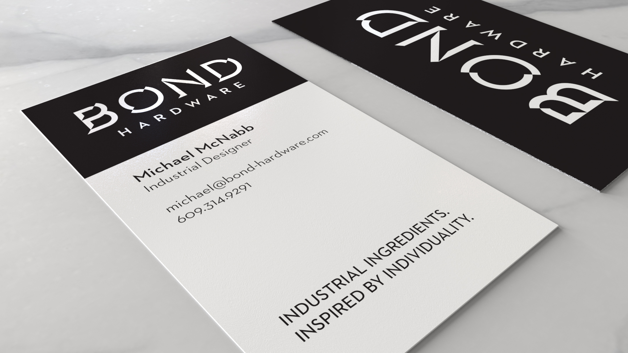
Bond Hardware Branding
Visual Identity Refresh
Logo / Jewelry Hallmark Development
The original intent was to create a new logo for print & digital work, & to create a seperate hallmark for use on jewelry due to the original logo’s legibility issues at small sizes.
After extensive rounds of research & sketching, it was decided that rather than starting from scratch, a redesign of the already recognized existing logo so that it could serve both functions would be more beneficial.
Branding Improvements
Custom Logo Treatment
old / new
Replaced the original freeware, student created typeface with a custom treatment based on Proxima Nova.
The beveled, geometric look of the original logo was retained, but with thinner, more elegant strokes and curves.
New Company Typeface
old / new
The original typeface Futura was hard to read when engraved on jewelry, so I replaced it with Neutraface 2. Neutraface 2’s wider glyphs, medium x-height, & solid kerning make it easier to read both engraved or on the screen, while retaining the geometric characteristic of the brand.
Type Size & Kerning
old / new
The size of characters was increased & kerning was improved. The characters in the original logo were poorly kerned, as well as optically off-center.
Images